

 哪裡不一樣—— Reason VS. Cause
哪裡不一樣—— Maintain VS. Remain
哪裡不一樣—— Question VS. Problem
哪裡不一樣—— Reply VS. Response
哪裡不一樣—— Empathy VS. Sympathy
哪裡不一樣—— Effective VS. Efficient
哪裡不一樣—— Duty VS. Responsibility
哪裡不一樣—— Data VS. Information
哪裡不一樣—— Assure VS. Ensure VS. Insure
哪裡不一樣—— Common VS. Normal VS. Ordinary
哪裡不一樣—— Reason VS. Cause
哪裡不一樣—— Maintain VS. Remain
哪裡不一樣—— Question VS. Problem
哪裡不一樣—— Reply VS. Response
哪裡不一樣—— Empathy VS. Sympathy
哪裡不一樣—— Effective VS. Efficient
哪裡不一樣—— Duty VS. Responsibility
哪裡不一樣—— Data VS. Information
哪裡不一樣—— Assure VS. Ensure VS. Insure
哪裡不一樣—— Common VS. Normal VS. Ordinary
英語長文章 - Good Charts: The HBR Guide to Making Smarter, More Persuasive Data Visualizations
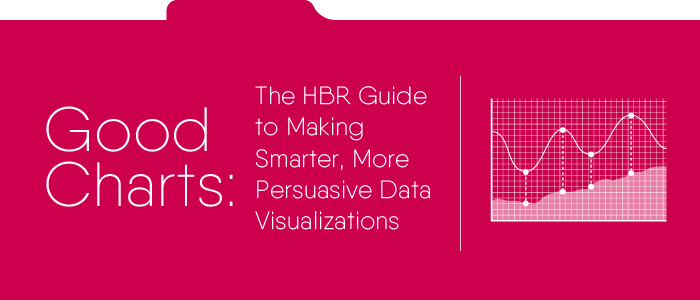
作者:Scott Berinato
出版社:Harvard Business Review Press
中譯本:哈佛教你做出好圖表,三采文化出版
▎視覺化已經成為這個時代必備的新語言與技能。如果你會「打開PowerPoint或
Excel,選擇適合圖表,填入資料」,你其實並不懂怎麼做一個好圖表。
▎好圖表不是從畫圖開始,而是從思考開始。視覺溝通一開始,要想清楚兩個問題。
▎一小時就能提升製作圖表能力。
文章難度:★★☆☆☆
預估閱讀時間:02:30
Visual thinking has never been so important: There has been massive increase in visualization. So much data is hitting us so quickly that we need a new way to communicate. One of the best parts of《Good Charts: The HBR Guide to Making Smarter, More Persuasive Data Visualizations》is that it lets you realize that visualization is not hard to learn.
視覺思維從來沒有如此重要:視覺化的資料大量增加;我們接觸的資料多到需要新的方式進行溝通;同時,每個人都在進行視覺化。《哈佛教你好圖表》其中一個最棒的部分是,使你了解到學習視覺化並不困難。
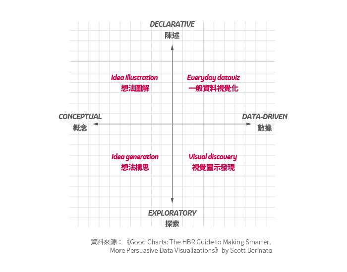
As the author says, "Mastering a simple process will have an outsized impact on the quality and effectiveness of your visual communication." To learn to "craft" a chart, you should begin by getting to know the art and science behind charts, and a brief history of visualization. You then come to understand how we perceive a chart when it hits our eyes. Unlike how we read sentences and paragraphs, when seeing a chart we don't go by orders, and we don't read in steady pace--like how we read sentences. Then, you can understand the essence of creating better charts. The author asks us to "resist the impulse" to choose a chart type immediately and click a button to create the chart. Instead, ask yourself two questions:
作者說:「掌握簡單的流程,就能大幅提升視覺溝通品質與效果。」打造好圖表,要先了解圖表之後的藝術與科學,視覺化的歷史。接著你會了解人看到圖表時,如何接收資訊。與閱讀文字句子段落不同,我們讀圖表沒有一定閱讀順序,也沒有穩定的閱讀速度。接著,你會進入創造好圖表的核心。作者要我們「抑制衝動」,不要立刻選好圖表類型、按個鍵就開始做圖表了。請先問自己兩個問題:
1. Is the information conceptual or data-driven?
這是屬於「概念」或「數據」的資訊?
2. Am I declaring something or exploring something?
我是要「陳述」或「探索」某件事情?
The two questions bring out four potential types of visualizations. Differentiating the type of your chart will help you decide the forms, time and required skills (from you or your partners.) The upper (declarative) quadrants should focus on output and simplicity, since the audience is usually a beginner. The lower (exploratory) quadrants should focus more on generating new ideas for your team to learn.
兩個問題會帶出四種視覺化類型,辨別出你想做的圖表類型,有助於決定形式、製作時間與需要的技巧(可以是你或你的合作夥伴具備的技巧。)上方的(陳述)象限,應該把重點放在產出和簡化,因為針對的聽眾通常來自外界。下方的(探索)象限,重點應該放在形成團隊可學習的想法。
Many more ideas about the four types are examined in the book, including required skills and media for each of them. The author also demonstrates how to build a better chart from preparation, talking and listening, sketching, to prototype, all within one hour. Later on, you'll learn to refine the charts-- "simplicity is courageous," says the author--and present your story. You will also benefit from learning about various cases and people worth knowing in the visualization world.
書中針對四種類型圖表深入介紹,包括各類型所需要的技能和使用媒材。作者也展示如何在一小時內,從準備,對話傾聽,畫草圖,到製作原圖。之後,你會學習到如何美化圖表—作者說,「簡單是一種勇氣。」—以及如何說一個故事。各種案例與視覺化領域中值得認識的人物,也會令你獲益良多。
文/Nikki Lu
本文收錄於英語島English Island 2018年4月號
訂閱雜誌
| 加入Line好友 |  |